Adelaide University Internship Experience - Ivy Ling Luo

Welcome Ivy!
Ivy Ling Luo joined our SAcommunity Data Analytics Team for her University of Adelaide SET (Sciences, Engineering and Technology) Internship for her Masters of Computing and Innovation Semester 2, 2024: 22 July 2024 - 18 November 2024.
She completed a 140 hour internship onsite with SAcommunity at the Connecting Up Office, Infoxchange for 2 days (15 hours) a week for ~10 weeks around her classes finishing her internship on the 15 October 2024.
Ivy returned to Connecting Up as a volunteer on the 16 October 2024 to continue her exploration of Data Analytics in the Team.
We provided a reference and were so pleased to congratulate Ivy on her new position as Helpdesk Consultant at Visualcare, a leading end-to-end care management software platform. It was great to hear from Ivy on February 27 that she successfully transitioned to employment, and will start on 3 March 2025!
"I’ve got confirmation that I will start on Monday. Thank you." ~ Ivy
Total Hours 191 This Year 3 Joined 13 August 2024 Last Check-in 27 February 2025
Personal Biography
Ivy is in her final semester of Master of Computing and Innovation at the University of Adelaide. She came to Australia on a working holiday visa and has spent her early years in Alice Springs, Northern Territory before moving to Adelaide in February 2023 to pursue her studies.
A passionate coffee enthusiast with a background as a barista, Ivy currently works as a casual retail consultant at Telstra. Her graduate project involves developing a no-code solution designed to assist non-technical users in accessing time series data from a database and visualizing it effectively.
At Connecting Up, Ivy is eager to deepen her understanding of data analytics, enhance her hands-on experience, and expand her professional network. She is particularly interested in mastering tools such as Power BI and Google Analytics to expand her skillset.
Looking ahead, Ivy aims to build a career as a Web Developer or Data Analyst. She is excited about leveraging the knowledge and skills she has acquired through her studies and professional experiences to make meaningful contributions in these fields.
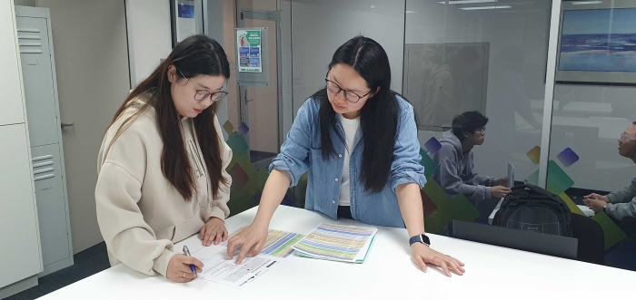
Ivy has selected the Mount Barker District Council for her Power BI and Canva council reports, focusing on a database of approximately 382 community services operating in the area. Her reports cover the financial years 2021-2022, 2022-2023, and 2023-2024, along with a four-year comparison from 2020 to 2024. The completed reports can be found >>here.
Volunteers and interns are encouraged to attend monthly SAcommunity Team meetings, Connecting Up staff meetings, as well as quarterly all-staff Infoxchange Town Hall meetings to understand more about the organisation as a whole.
Organisation-wide news, events and projects are communicated through the staff channels, with weekly CEO Updates from David Spriggs. Informal 'Lunch and Learn' educational sessions, and network meetings create connections with staff. Whilst peer-to-peer training or capacity building and telephone techniques training allow for networking with other volunteers. Interns are also given opportunities to attend stakeholder and partner events as they arise.
Relevant meetings and training sessions Ivy has attended include:
Training and Development - Telephone Techniques
The principles of hybrid work were also emphasized, focusing on balance, teamwork, wellbeing, connection, and ownership. These principles are intended to support employees in managing their work-from-home experiences effectively while maintaining strong team dynamics and personal wellbeing.
A significant takeaway from the session was the emphasis on communication management within Infoxchange. Clear communication practices are essential, including defining the purpose and goals of meetings and utilizing the appropriate formal communication tools. Adherence to branded templates for both internal and external communications was highlighted to ensure consistency in branding and messaging.
Elaine recommended a diet rich in a variety of plant-based or minimally processed foods, such as fruits and vegetables. She suggested incorporating moderate amounts of high-quality proteins, including seafood, lean meats, and dairy products, while limiting the intake of highly processed foods, and shared practical tips for boosting mood through diet, such as consuming five servings of vegetables and two servings of fruits daily, including Omega-3 fats from fish and nuts, and ensuring adequate intake of vitamins and minerals for brain health.
Elaine also addressed the appeal of hyper-palatable foods, which are often high in calories but low in nutritional value. While these foods can offer a temporary mood boost, they are often difficult to resist and can create a cycle of craving and overconsumption. This initial pleasure is frequently followed by a desire to repeat the experience, leading to more consumption of unhealthy foods, which can have long-term effects on overall health and well-being.
Overall, the webinar was valuable for gaining a deeper understanding of how diverse food choices impact health. It encouraged me to reassess my current diet and consider adopting a healthier approach for improved well-being.
Jo also encouraged attendees to share their examples of innovation. I learned that Andrew Mahar, Infoxchange’s founder, whose innovative approach in the 1990s led to the creation of the first online crisis accommodation register to help people experiencing homelessness find shelter. Similarly, the SAcommunity directory transitioned from printed Yellow Pages to an online format in the 1990s, marking another innovation in that space.
A key takeaway for me was the introduction of the 3 Horizons model, which outlines three stages: Now, Near Term, and Future. Jo mapped Infoxchange’s products and services to each stage and linked it to the 70/20/10 Principle—spending 70% of time and resources on current operations, 20% on learning and growth, and 10% on exploring new ideas and processes. This framework resonated with me as a strategic approach for organizing my own career plans. By applying this model, I can more effectively structure my goals, balance immediate priorities with future aspirations, and reduce uncertainty as I move forward in my career.
IX Community & Cultural Events & Activities
Cake and Connect - R U OK? DAY on 10 September 2024
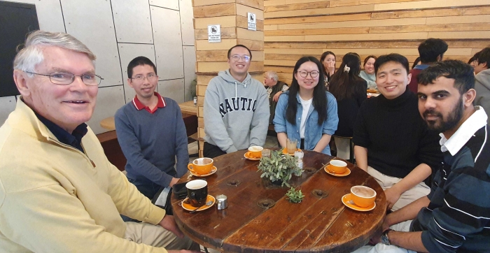
The Cake and Connect session was both delightful and insightful. Sharing cakes and engaging in casual conversations created a friendly and relaxed atmosphere. On top of that, we picked up some useful tips for boosting our physical and mental health, like getting some morning sunlight and taking a cold shower to invigorate ourselves. These little changes can make a big difference in how we feel day-to-day.
The opportunity to genuinely check in with one another was invaluable. The session was a reminder that reaching out should extend beyond the event itself. It’s essential to check in not only with colleagues but also with our families and friends. The day underscored that genuine care and connection can happen at any time, and that is something we should carry with us every day.
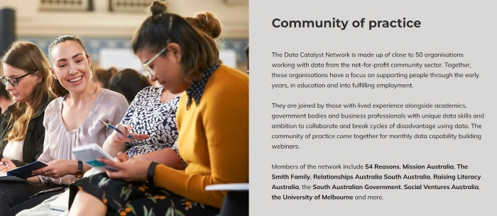
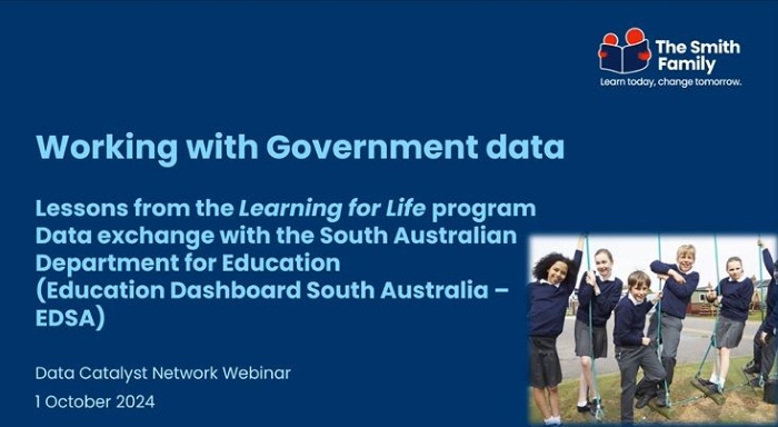
Data Catalyst Network (DCN): Brings together people from across sectors, to break cycles of disadvantage through the innovative use of data. Interns and volunteers at SAcommunity are invited to DCN meetings to understand more on data usage in the not-for-profit sector.
Participants of the Data Catalyst Network will advance their data maturity while sharing and improving data insights through unique cross-sector partnerships to disrupt disadvantage. As a collective, the network will harness data and knowledge from the not-for-profit community sector, academia, government and business to better use and manage data to improve the lives of people across Australia.
Mentor Meeting 17 September 2024
Volunteers and interns both prepare 5 questions for their mentors and then are encouraged to record 5 aspects they felt were helpful for them to share on their portfolio for both themselves and other volunteers, and Ivy shared her experience with Todd Guanhua Tao in meeting Cameron Brown Web Developer, Infoxchange.
Meeting Cameron Brown was an enlightening experience that provided me with valuable insights as a graduate entering the IT field. Cameron shared his perspective on the job market, emphasizing that languages and frameworks like Python, JavaScript, React, and PostgreSQL are currently in high demand. He highlighted the importance of soft skills and problem-solving abilities over focusing solely on technical expertise, and he noted that networking and building relationships are often critical in securing jobs.
Cameron stressed the value of building a strong portfolio through real-world projects and internships, with GitHub being an essential platform to showcase practical skills. He also explained that formal qualifications are not necessarily required for success in web development, as hands-on experience and the ability to solve problems are more important. Additionally, Cameron acknowledged the difficulty of staying up to date with every new technology, advising that it’s better to focus on learning what’s relevant to one's role.
The most impactful takeaway from our discussion was Cameron’s advice not to stress about excelling immediately as a new graduate. He emphasized that it’s more important to learn, make mistakes, and ask questions rather than striving for perfection from the start. This perspective was reassuring, as it reminded me that not being proficient in every technical skill is part of the learning process.
 Digital Training & Development
The webinar began by encouraging attendees to reflect on five key questions ranging from identifying the organization's goals, determining how to achieve those goals to understanding what is needed to reach the goals. It was emphasized that the foundation of data strategy must align with organizational purposes, and all data efforts should ultimately serve these objectives.
Understanding the goals allows organizations to integrate their data strategy with their business strategy. For instance, the example from Mission Australia demonstrated how a well-crafted data strategy and insightful analysis can produce robust and impactful results. A data strategy involves identifying the data, tools, and techniques necessary to answer specific questions.
The next step involves gathering information both internally and externally, reviewing the findings, and reaching consensus. Data review includes confirming the security level and type of data collected to ensure that access is appropriately restricted. Following this, the information from interviews and data reviews is used to pinpoint organizational priorities and identify gaps in the collected data. The final theme of the webinar focused on project objectives, explaining how to address specific problems using the collected data.
My key takeaways from the webinar include the importance of confirming the purpose of data collection, determining the target audience for the data report, and identifying the issues the report will address. Once these goals are established, we can proceed with processing, analyzing, and presenting the data effectively.
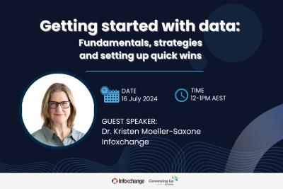
The webinar, presented by Kristen Moeller-Saxone, Data Capability Lead at Infoxchange, and Vivek Katial, Co-Founder and Executive Director at Good Data Institute (GDI), offered practical advice on selecting the right data tools and infrastructure based on an organization’s size and data needs. The session covered a range of tools, from basic options like Google Sheets and Excel for smaller datasets and fewer users to more advanced platforms such as Azure, AWS, Salesforce, and PostgreSQL for handling larger datasets, more users, real-time data needs, and complex analytics.
A significant portion of the webinar focused on the full data project lifecycle. Vivek introduced attendees to the phases of objective setting, data collection, analysis, and action, providing detailed explanations of what each phase entails. This comprehensive overview aimed to equip participants with a clear understanding of the entire data project process. Vivek also highlighted effective strategies for managing messy data, including a simple data cleaning process. The use of AI, particularly ChatGPT, was emphasized to streamline and accelerate data cleaning. Attendees learned how to leverage AI for generating effective formulas in Excel or Google Sheets through clear and structured instructions.
One of the standout aspects of the webinar was the case study presented by GDI, showcasing their real impact measurement project with CaringKids. GDI demonstrated how they used de-identified raw data—including origin and destination addresses, courier costs, and box weight—to calculate the total distance toy boxes traveled. By employing a custom Google Maps function in Google Sheets, GDI was able to visualize the distribution of toy boxes across Australia. This practical example underscored the importance of data visualization in understanding and communicating data insights.
The key takeaway from the session was GDI's recommendation to migrate toy box order forms to a more automated system. This change would reduce the manual data entry workload and enhance data analysis efficiency. GDI provided the necessary technical skills and established a framework for ongoing analysis, ultimately improving the operational capabilities of CaringKids.
Chris Olsen, Senior Cloud Solution Architect, and Benny Austin, Cloud Solution Architect at Microsoft, recently presented an insightful webinar on leveraging Power BI for data analysis and visualization.
Chris provided a comprehensive overview of Power BI, explaining its core functions and capabilities. He demonstrated how Power BI connects multiple datasets with just a few clicks, integrating various resources to generate deeper insights. Additionally, Chris highlighted the integration of Copilot, which enhances Power BI’s functionality by allowing users to ask questions in natural language, thereby maximizing its potential.
Benny then walked us through the process of getting started with Power BI, using sample sales data to illustrate its features. He showcased how AI integration within Power BI enables users to ask questions and receive immediate answers, with visualizations automatically adjusting based on the query. Benny also demonstrated how Power BI’s Copilot can generate summaries and highlight key aspects of the dataset. Additionally, he showed that users can provide prompts in natural language to Copilot, which can then create visualizations based on those requests. This feature enhances the user experience by making it easier to generate and customize visualizations without needing to manually configure each one.
My key takeaway from this webinar is the versatility of Power BI. It can be accessed from various devices via its app, allowing for seamless collaboration. Users can annotate visualizations and share snapshots, with dashboards automatically adapting for different platforms—Windows, iOS, and Android. Power BI’s integration with Office apps and the abundance of learning resources available make it a powerful tool for enhancing work efficiency and accessibility.
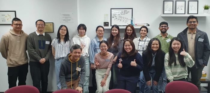
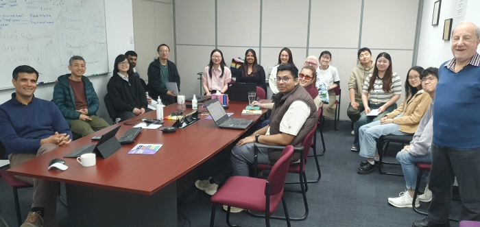
2024 SAcommunity Interns and Volunteers
This internship has been a major influence on my career path, strengthening my interest in data analytics and web development and expanding my understanding of workplace culture and personal growth. Working directly with data and creating visualizations boosted my confidence in my technical abilities, showing me how impactful data analysis can be for community services. Just as importantly, being in a professional setting within a local organization and connecting with other interns and employees really improved my soft skills, including communication, problem-solving, and empathy—skills that are essential in any role.
Looking ahead, I feel much more prepared to pursue a career that blends technical and non-technical strengths. I’m eager to apply what I’ve learned about effective communication, proactive planning, and empathy in the workplace. Cameron’s advice on building a strong portfolio also motivated me to continue documenting my projects on platforms like GitHub to showcase my skills. This internship wasn’t just a learning experience; it was a step toward building a career where I can contribute meaningfully through technology and collaboration.
In summary, my internship with SAcommunity has not only improved my technical abilities but also shifted my perspective on what professional success looks like. I now approach my career goals with more clarity and confidence, equipped with both the technical and soft skills needed for a fulfilling career in data analytics and web development. I’m grateful for this experience, which has given me the tools, insights, and connections to build a career that aligns with my aspirations and values.
Sign up for the newsletter!
Subscribe to our monthly newsletter to receive news, information and events for the community sector in SA.


